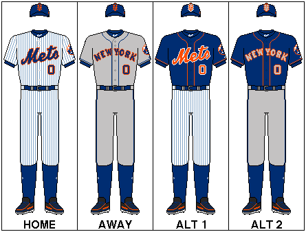
The current uniform roll of the Mets since 2017. (This does not reflect on any changes made to current uniforms such as sleeve patches.)
The New York Mets, founded in 1962, returned National League baseball to New York following the departure of the Brooklyn Dodgers to Los Angeles and the New York Giants to San Francisco. The Mets' uniform was designed to incorporate elements of both departed clubs, with the Dodgers' royal blue becoming the Mets' primary color and the Giants' orange the trim color, along with the Giants' "NY" crest adopted as the new team's cap logo. The original Mets uniform had a "clean and classic" look that, while it has undergone a number of changes over the course of the team's history, has never been substantially revised. The basic template has always been a conventional short-sleeved baseball uniform with "Mets" in script on a white pinstriped home jersey, and either "NEW YORK" or "Mets" on a gray road jersey. The most notable variations were the "racing stripe" uniforms of the 1980s and early '90s, and the addition of black as a trim color along with black alternate jerseys and caps that were worn from 1998 through 2011.
For 2012, in recognition of its 50th Anniversary, the club restored its classic look by removing the black trim from all of its uniforms and phasing out the black jerseys and caps. Since 2013 the club has adopted blue alternate jerseys and caps, but has generally worn its primary uniform in most games, home and away.
History[]
1960s[]
The original Mets uniform from 1962 was similar in style to the team's current uniform. The home uniform was white with blue pinstripes, "Mets" script in blue outlined in orange across the chest, with the player's number on the back of the jersey in blue block numerals outlined in orange, but no player name on the back and no numerals on the front. The cap was blue with the orange "NY" crest on the front panel, the same as the current cap but with a blue button on top of the crown. The "skyline" logo appeared as a patch on the left sleeve. The road uniform also resembled the current road grays, except with no player name on the back and no numerals on the front.
Apart from the addition of numerals to the front of the jerseys in 1965, underneath the wordmark on the player's left side, and some variations to the numeral typeface, this uniform remained largely unchanged through 1973.
A special World's Fair patch was worn on the left sleeve of the home jersey and right on the road in 1964 and '65, in place of the Mets' "skyline" logo.
In 1966, the Mets from then on wore the team patch on the left sleeve on the home uniforms. Although the road had it there since the team began play in 62'.
In 1969, the logo patch was supplanted by a patch commemorating the 100th Anniversary of Major League Baseball.
1970s[]
1973-1974; 1976[]
In 1973, the team wore a NYC Diamond Jubilee patch on the right sleeve only on the jackets and only for this season. Also during the season the team wore a black armband to mourn the death of Gil Hodges on the left sleeves of the uniform jerseys.
In 1974, the "Mets" script replaced the "NEW YORK" wordmark on the road jersey. The home uniform was unchanged.
On a few occasions in 1976, the Mets wore special "pillbox" caps that had a cylindrical (as opposed to hemispherical) crown and three thin orange horizontal stripes across the front.
1978-1979[]
In 1978, the home and road jerseys changed from conventional button-down jerseys to pullover jerseys, with two buttons just below the collar. The blue piping was removed from the road jerseys. Three thin stripes (blue-orange-blue) were added to the sleeve cuffs and collar on both home and road jerseys.
In 1979, player names were added to the back of the jerseys, radially arched above the number in blue block letters outlined in orange.
1980s[]
1981[]
Starting this season the Mets began using "batting practice jerseys," also referred to at the time as "warmups." These would be blue jerseys but different from the one's used an alternate road uniform starting in the following season. These blue jerseys would last into the late 1990s.
1982-1984[]
In 1982, the "skyline" logo was removed from the left sleeve of the home and road jerseys. To the road jerseys were added thick "racing stripes" (orange-blue-orange) on the shoulders from neck to sleeve cuff, on the sides of the jerseys from armpit to hip, and on the sides of the pants from hip to cuff; the collar and sleeve-cuff striping were removed. The two-button collar was replaced by a v-neck.
The "racing stripes" and a blue v-neck collar were added to the home uniforms in 1983.
From 1982-84, the team occasionally wore a blue jersey on the road. The blue jersey had the "Mets" script, numerals and lettering in white with orange outline, and orange-white-orange striping on the collar and sleeve cuffs.
1986-1988[]
In 1986, the team wore a special 25th Anniversary patch on the left sleeve. The patch was worn on the right sleeve of the jackets.
In 1987, the "Mets" script on the road jersey was replaced with "New York" in cursive script. This was replaced in 1988 by "NEW YORK" in radially-arched block letters, with no player numerals on the front of the jersey. Also in the year the Mets right sleeve had a white Rawlings logo on it.
Also in the year Keith Hernandez's road jersey had a C patch standing for captain of the team only on the road jersey of his for only this season. The C is outlined in orange with blue filled in.
Also in 1988, a thin white outline was added to the wordmark, numerals, lettering, and "racing stripes."
1990s[]
1991-1992[]
In 1991, the pullover jerseys were replaced by button-down jerseys.
In 1992, the team wore a patch on the left sleeve, consisting of a white circle with black outline, pinstripes and letter "S" in honor of the late William A. Shea, the New York attorney for whom Shea Stadium was named.
The Mets wore their first "throwback" (or "Turn Back the Clock") uniform, a 1962 replica, for a game against the Cincinnati Reds at Shea Stadium on August 30, 1992. The jerseys had the primary-logo patch on the left sleeve even though it was not actually used on the home jersey in the Mets' inaugural season.
1993[]
In 1993, the color blue used on the Mets uniforms was changed to a slightly darker shade. The "racing stripes" were removed from both home and road uniforms, and the "skyline" logo returned to the left sleeve. The "Mets" script on the home jersey was modified, and for the first time incorporated a "swoosh-tail" attached to the letter "s" underlining the wordmark. The road jersey had "New York" in cursive script, similar but not identical to the script used in 1987, and also with a "swoosh-tail" attached to the letter "k" underlining the wordmark. The road uniform had thin blue-orange-blue piping on the sleeve cuffs and on the sides of the pants from hip to cuff.
1994[]
In 1994, player numerals were added to the front of the road jersey, below the wordmark on the player's left side, and the piping was removed from the road uniform. Also in 1994, the Mets' "skyline" logo was modified to incorporate rectangular spaces above and below the circle, containing text commemorating the 25th anniversary of the 1969 "Miracle Mets." On the right sleeve was a patch commemorating the 125th Anniversary of Major League Baseball. The Miracle Mets patch was featured on the left sleeve of the blue batting practice jerseys.
1995-1996[]
The Mets returned to their traditional uniform design in 1995. The original "Mets" script was restored to the home jersey, the original "NEW YORK" wordmark was restored to the road jersey along with the original piping, and the white outline was removed from the wordmark, numerals and lettering on the road jersey. The original shade of blue was also restored to the entire uniform.
In 1996, the team wore a patch on the right sleeve honoring National League umpire John McSherry who passed away.
1997[]
In 1997, the Mets introduced an alternate home uniform that was plain white with no pinstripes, and blue piping matching the road uniform. The team also introduced an alternate cap with a white crown and blue bill. The "NY" crest on the alternate cap was blue with an orange outline. The white cap was worn with the white alternate jersey on some occasions early in the season. There was also a white crown and blue bill helmet matching the cap, but was only worn by John Olerud during a few occasions in the season.
Also in 1997, the team wore a patch on the right sleeve of all three jerseys commemorating the 50th anniversary of Jackie Robinson's breaking of Major League Baseball's Baseball color barrier.
1998[]
In 1998, a black alternate jersey was introduced, matching the white home alternate in style but with the "Mets" script, numerals and lettering in blue with white outline and orange drop-shadow. The black jersey was worn as an alternate in both home (with the white home alternate pants) and and road (with the road gray pants) games. The team also introduced a black alternate cap with blue bill, and "NY" crest in blue outlined in orange, to be worn with the black jerseys. The white alternate cap from 1997 was discontinued. A black drop-shadow was added to the script, numerals and lettering on the home white alternate and road gray jerseys (Discontinued in 2012). However, the black alternate logo didn't exist for this black uniform as the light blue primary logo was used on the left sleeve just for this season as the black alternate logo would come the next season in 99'.
1999[]
In 1999, a road version of the black alternate jersey (with the "NEW YORK" wordmark) was introduced. An alternate version of the Mets' primary logo, with a black skyline and "Mets" script in blue outlined in white with orange drop-shadow, was introduced in 1999 and worn on the left sleeve of both black alternate jerseys. A second black alternate cap was added, to be worn with both black alternate jerseys, this one with a black bill and "NY" crest in blue outlined in white with orange drop-shadow (matching the script, numerals and lettering on the black alternate jerseys). This became commonly known as the "solid black cap" or "all-black cap" while the 1998 black alternate cap, which was retained, became known as the "two-tone cap" thanks to its blue bill. However the road alternate was retired after the 2008 season.
Also in 1999, a black drop-shadow was added to the script, numerals and lettering on the home pinstriped uniforms, and player names were removed from the back of all three home jerseys.
Speaking of primary logos, in 1999 the home and road jerseys Mets patch on the left sleeve was changed with a dark blue skyline replacing the original logo with a light blue skyline used from 62 to 98.
On July 17, the Mets wore gray flannel 1969 replica uniforms for a road game against the Tampa Bay Devil Rays.
Another change happened in 1999 when a MLB promotion called Turn Ahead the Clock. This was a promotion to see what the teams might be in the future when old teams relocated to form new teams. The Mets in this case became the Mercury Mets. They did it when hosting the Pirates in July. They only wore it just for that day in the season.
Although the Mets continued to officially designate the pinstriped uniform as the club's primary home uniform, and the blue cap with orange crest as the primary cap, the reality of what was worn on the field from 1998 through 2009 was quite different. At some point during the 1998 season, the team began occasionally pairing the two-tone cap, which was meant to be worn with the black jerseys, with the white alternate jerseys and gray road uniforms as well. By the end of the 1998 season the two-tone cap had become the team's de facto road cap and was frequently worn at home as well, except with the pinstripes. After 1998, the blue cap was worn only rarely and exclusively at home; the road gray jerseys were paired exclusively (except for one game in 2008) with the two-tone cap, which finally became the official road cap in 2001, and the black jerseys were paired exclusively with the all-black cap. Although the home pinstriped and white uniforms were paired at various times with all three caps, in most home games during this period the team wore the white alternate uniform with the two-tone cap. All of the uniforms were worn with black socks, belts and under sleeves, except when the blue cap was worn with the white or pinstriped home uniform, in which cases the accessories were blue.
2000s[]
2000[]
In 2000, player names were returned to the back of the three home jerseys.
From March 29 to March 30, the Mets opened the season against the Chicago Cubs at the Tokyo Dome in Japan making it the first time that an opening day game was held outside of North America. The team wore an AIU insurance company patch on the right sleeve. On the left side of the caps was a commemorative logo honoring the series. On the right side of the helmets was an ampm logo of the convenience store chain.
A 1969 "throwback" home uniform was worn on April 25, 2000, for a home game against the Cincinnati Reds.
For the 2000 World Series, the Mets wore the series logo on the right sleeve of the uniforms and on the left side of the caps.
2001-2002[]
The team wore a patch in 2001 labeled 20/60 in honor of Mets minor league player Brian Cole and Tommie Agee who both died and it was in their honor as it was placed on the right sleeve.
On July 15, 2001, for a home game against the Toronto Blue Jays, the Mets wore replica uniforms of the 1947 New York Cubans of the Negro Leagues. These uniforms were white with red piping on the placket, shoulders, sleeve cuffs and pants. Across the chest was "NEW YORK" in red lettering, angled upward, above a black silhouetted baseball bat, with "CUBANS" inscribed horizontally underneath with the letter "C" encircling the end of the bat. The caps were black with a red bill and the Mets' "NY" crest in red. The Mets would dress as the Cubans again for Negro League tribute games in subsequent seasons.
From 2001-2002 the team wore a commemorative patch in honor of the people who lost their lives during 9/11. It was worn on the right sleeve underneath the 20/60 patch. In 2002, the Mets wore a patch on the right sleeve commemorating the club's 40th Anniversary. The 9/11 patch was worn right underneath the 40th anniversary patch on the right sleeve.
In addition, beginning September 21 at their first home game after the attacks, the Mets wore caps of New York City's first-responder agencies—the Police Department (NYPD), Fire Department (FDNY), Emergency Medical Services (EMS) and Port Authority Police (PAPD)—in place of their regular game caps. The Mets were only permitted to wear these caps during pre-game warmups on September 21 but defied MLB instructions and wore them in game play, that night and for the remainder of the season. All of the first-responder caps were navy blue, with either "NYPD" in white serif lettering, "FDNY" in thick yellow-orange-red gradient lettering, or the EMS or PAPD shield logo on the front. Typically, each player and coach chose one of the caps and wore that same one for the balance of the season.
On July 15-16, 2002, the Mets wore 1986 replica uniforms for home games against the Florida Marlins. The uniforms featured pullover jerseys with "racing stripes" similar to the 1983–1990 style, but without the 25th-Anniversary sleeve patch worn in 1986. This would be worn again in 2006 but with the anniversary patch.
2003-2004[]
From 2003-2004, the team wore a orange alternate jersey morally at home in '03 as they wore the home pinstripes jersey less and less. This lasted only for that season as in 2004 it returned to the normal use of the home pinstripes more and more at home. The orange jersey was also used as a BP and Spring Training uniform.
In 2004, the Mets wore a patch on the right sleeve commemorating the 40th Anniversary of Shea Stadium. Below this patch, embroidered onto the sleeve in black lettering on the pinstriped, white and gray jerseys and white lettering on the black jerseys, was the phrase "Ya Gotta Believe" and the name "TUG," in honor of former Mets pitcher Tug McGraw who died on January 5. Also in 2004, the name of longtime Mets broadcaster Bob Murphy was embroidered on the left sleeve above the "skyline" logo patch after Murphy died on August 3.
2004-2006[]
On June 13, 2004 at Kansas City, July 9, 2005 at Pittsburgh, and August 11, 2006 at Washington, they appeared as the 1944 Cubans in gray uniforms with black piping on the placket, sleeve cuffs and pants, "NEW YORK" in red in radially-arched sans-serif capitals across the chest, and "CUBANS" in vertically-stacked capitals on the left sleeve. The caps were black with a red bill and the "NY" crest in red outlined in white.
2006[]
Prior to 2006, throughout Mets history, the team's batting helmets were designed to match the caps. This continued through the adoption of alternate caps beginning in 1997, as each alternate cap had a matching alternate batting helmet with the same crown and bill colors, and the same "NY" logo crest applied as a decal on the front of the helmet. In 2006, however, the club began using the Rawlings Coolflo batting helmet and changed the design of the helmet that went with the two-tone cap, such that the cap and helmet no longer matched. The helmet shell was black; the bill and the front of the helmet were painted metallic blue, the area of which conformed to the surface contours of the helmet shell and faded gradually toward the back. The "NY" crest on the front of this helmet was black with white outline and orange drop-shadow. The blue and all-black helmets received the same metallic paint treatment as the two-tone helmet, but still essentially matched the respective caps as the metallic paint was the same color as the helmet shell (blue metallic on blue, black metallic on black), and the "NY" logo crests remained the same (orange on the blue helmet, blue with white outline and orange drop-shadow on the black helmet).
On August 19 and 20, 2006, the Mets again wore 1986 replicas, this time with the 25th-Anniversary sleeve patch, which was not featured back in the 2002 version, at Shea Stadium against the Colorado Rockies.
2007[]
In 2007, the team introduced a "Los Mets" jersey to be worn on occasions. The jersey was the home white blue piping with the Los on the top right corner above the Mets. The L in "Los" has a script curve. They would have this done with the same uniform in '08. Then with the pinstripe in '09 then again from 2011-2012.
2008[]
In 2008, the Mets wore a patch on the right sleeve denoting the final season of Shea Stadium. The same Shea logo was worn on the left side of the blue caps only in the final series at the ballpark. The black and the two-tone cap did not have it on either side.
With the "Los Mets" uniform in 2008, it was the same from '07 except that it had the Shea patch on the right as with the original without the Los. This would be the first of 5 times that this Los jersey had patches on it ('08-Shea, '09-Inaugural, '12-Kid 8/50th Anniversary, '13-All-Star Game, '14-Ralph Kiner and Frank Cashen). In '10 they didn't wear the uniform. For 2011-2014 see it below in the 2010s section.
2009[]
In 2009, the Mets wore a patch on the right sleeve to mark the opening of their new ballpark, Citi Field. A different Inaugural Season logo for Citi Field was embroidered on the left side of the caps. Neither logo patch contained the actual name of the ballpark, in deference to MLB rules prohibiting corporate names or logos (other than those of the uniform manufacturer) from appearing on the uniform; similar logos containing the name "Citi Field" were designed and used in publications, signage and other contexts. Also in 2009, the road ("NEW YORK") version of the black alternate jersey was discontinued, although the home ("Mets") version continued to be worn as an alternate in road games as well as at home.
For three games in mid-August against the San Francisco Giants at Citi Field, the Mets wore a "fauxback" (i.e., resembling the past or a particular era in style but not matching an actual previous uniform) designed to honor the old New York Giants. The uniform was off-white/cream-colored and displayed the letters "N Y" in large thick royal-blue capitals, in Tiffany typeface, on the front of the jersey on either side of the placket, with plain blue serif block numerals on the back. On the right sleeve was a patch depicting the team's mascot, "Mr. Met", in a running pose facing to the right of the viewer toward the front of the uniform. The jersey had thin blue-orange-blue striping around the collar and sleeve cuffs, and the pants had thin blue piping down the sides from hip to cuff. This uniform was worn with the Mets' standard blue caps and helmets, blue socks and undersleeves, and black belts.
2010s[]
2010[]
In 2010, the home white alternate uniform became the official home uniform. The pinstriped uniform was designated as an alternate, and the fabric color changed from white to off-white. This uniform was paired exclusively with the blue cap, which was still the designated home cap and was worn somewhat more often in 2010 than it had been from 1998-2009, but still only at home.
On May 29 against the Pittsburgh Pirates the Mets wore a New York Cubans throwback jersey this time without the white outline on the cap logo as opposed to in previous years when worn such as in 2001, 2004-2006.
On August 21 against the Milwaukee Brewers the team wore a New York Cubans throwback jersey in honor of the Negro Leagues resembling the one worn in 2001.
2011[]
In 2011, the team reintroduced (last being 2009) a "Los Mets" jersey which was used during Latina Fiesta Night. They were two used which an all blue with the name and number written in orange and one with the alternate home jersey in the Mets original script in the black shadow drop. Both had the Mets patch on the left leaving the right sleeve with no patch. In 2012 the writing of the name and number in cream white. It did not have the Mets patch as it had the Kid 8 on the right and the 50th anniversary on the left. The L in "Los" has a script curve. Also concerning the "Los" with the blue jersey matched the size of the Mets and with the alternate it was smaller and placed in the corner on the right near the shoulder above the Mets. Then in 2012 it matched the size of the Mets just like the blue uniforms in orange.
During one game in a doubleheader on August 29 the Mets wore their BP jersey which was allowed as for just once during the season in 2011 allowed under the permission of MLB. The jersey was light blue and the Mets, number and name with the original script with a backdrop shadow of black and orange. It didn't contain the Mets patch or any other patch on the sleeves.
2012[]
In 2012, the black drop-shadow was removed from all of the team's jerseys, and the two-tone cap was discontinued. The off-white pinstriped uniforms became the primary home uniform, the white uniforms became the home alternate, and the blue cap with orange crest became the sole uniform cap for both home and road games. The black jerseys and all-black caps were retained, to be worn on a few select occasions in 2012 before being discontinued in 2013. A special 50th Anniversary logo patch supplanted the "skyline" logo patch on the left sleeve of the home and road jerseys, was added to the right sleeve of the black jerseys, and was also embroidered on the back of the caps. A memorial patch for former Mets catcher and Hall of Famer Gary Carter was worn on the right sleeve of the home and road jerseys, and on the front of the black jerseys by the player's right shoulder.
In 2012, the Mets patch was phased out of the home and road jerseys from the left sleeve as the 50th anniversary patch was worn in it's place. The Mets patch was only worn on the alternate black jerseys on the left sleeve moving the 50th anniversary to the right and moving the Kid 8 patch above the Mets on the front right side. When the Mets wore the 1989 throwback road jerseys on August 3 the Kid 8 was worn on the right as the Mets and 50th anniversary patch was not placed on the left or anywhere on the uniform. For the "Los Mets" throwback jersey the Kid 8 is on the right and 50th is on the left leaving the Mets patch phased out of it for the first time when these jerseys were introduced.
2013[]
In 2013, the Mets released new additions to the uniforms with new caps, jerseys and a patch. This year the team will be hosting the all-star game at Citi Field and in honor of it the team introduced a patch in honor of the event on the left sleeve of the uniforms. 2 new caps were introduced with both having blue on top and orange on the bottom as the first two-toned caps since the black & blue one. One of them was worn during Spring Training which had the logo of Mr. Met on top. The other is for the regular season which has the NY logo outlined in white. They also have two new blue jerseys for both home and road. The wordmark will be in orange with the home being "Mets" and the road being "New York".
The jerseys have orange piping, orange "Mets" script, numerals and lettering with white outline. The road version has grey inside of the orange outline of the "New York" script, numerals and lettering. These jerseys will also have the 2013 all-star game patch on the left sleeve.
Starting the 2013 season, the Mets wore a memorial patch on the top left corner on the front in honor of the victims of the Newtown shooting for only for the first 3 days of the season. The Mets also made changes to the helmets as the name of the player on the tip and on the back were removed as the front was left empty expect the NY logo as an orange number sticker was placed on the back above the MLB logo.
On April 16, 2013, both the Mets and the Rockies wore their 1993 throwback jersey in honor of the Rockies 20th anniversary and the first game the Rockies played which was against the Mets at Shea Stadium. The uniform had the Mets patch on the left with nothing on the right.
On July 24, 2013, the Mets introduced their new "Los Mets" uniforms. The uniform is in orange with the script, number and players name in blue with a white outline. The left sleeve contains the 2013 all-star game patch with no patch on the right. This is the second time the Mets patch was phased out of the "Los" uniforms since 2012. The uniform is paired with the 2013 two-tone cap with the blue on top with the orange brim.
2014[]
For the 2014 season, the Mets added the image of Mr. Met on the left sleeve of the blue uniforms which will replace the all-star game patch from 2013. Also a new patch was placed on the right sleeve on the spring training and regular season uniforms to honor Ralph Kiner who passed away. The non-blue uniforms will have the Mets patch on the left sleeve as the Ralph Kiner patch will be on the right sleeve on all the uniforms.
In addition, the Mets introduced a military-camouflage alternate jersey for 2014, to be worn in Monday evening home games beginning April 21. This jersey has the regular home "Mets" script and numerals with no piping, and an American flag patch in place of the primary logo on the left sleeve. It is worn with a matching camouflage cap, with the "NY" logo crest in blue outlined in orange. This is part of a "Military Monday theme."
On June 28, 2014, the Mets wore a Brooklyn Royal Giants throwback in honor of the Negro Leagues. The uniform was the color of the Mets alternate blue with orange lining down the sides of the sleeves and pants. It has the patch of the team on the left sleeve. The caps and helmets are blue and feature the Royal Giants insignia in orange. It was the road version as it had "Royal Giants" in big orange letters on the front and the back has the number in orange with no name of the player. The helmets have the same insignia in orange and on the back is the MLB logo and an orange number sticker right above the logo. This is the first uniform worn in 2014 that did not have the Ralph Kiner patch on it on the right sleeve. These were worn again twice in Atlanta on June 20, 2015 and June 25, 2016, in Atlanta without any team patches.
On July 4, 2014, the Mets introduced a patch honoring the passing of former GM Frank Cashen. The patch is underneath the Ralph Kiner patch on the right sleeve on all of the uniforms. It was also on this day that all MLB team's wore a patch honoring the 75th anniversary of Lou Gehrig's luckiest man speech. It became the first time in team history that a patch was worn in honor of a former player from another team. Gehrig played his entire career for the New York Yankees from 1923-1939. The patch was worn on top of the Mets on the home blue alternate uniform.
On July 27, 2014, all MLB team's wore a patch honoring the 75th anniversary of the National Baseball Hall of Fame. The Mets wore the patch above the New in New York on the road grey uniform.
On July 29, 2014, the Mets wore their "Los Mets" uniforms which had the same design from the 2013 version. For the third straight year since 2012 the Mets patch was phased out of the uniform from the left sleeve. The right sleeve had the Ralph Kiner and Frank Cashen patches and the left sleeve for the first time had Mr. Met on it.
2015[]
For the 2015 season, the Mets changed the fabric color of the home pinstriped uniforms from off-white to white, and discontinued the white home alternate uniform. The club also added an alternate road cap, with a blue crown and bill and the "NY" logo in silver-grey outlined in orange, matching the road blue alternate jersey; as with the home alternate cap, there is no corresponding alternate batting helmet.
For the 2015 playoffs in the NLDS and NLCS rounds the wore a 2015 postseason patch on the right sleeve of the uniforms and on the left side of the caps. However, for the World Series the logo was worn on the right sleeve of the uniforms and on the left side of the caps.
2016[]
In 2016, the Mets announced the end of the military camouflage uniform and for every Sunday home game they will wear 1986 throwback jerseys and it features a patch commemorating the 30th anniversary of the 1986 championship on the left sleeve. On July 20, 2016, the Mets wore replicas of their 1986 road uniforms for a game against the Chicago Cubs at Wrigley Field.
From May 14-15, 2016, all MLB teams wore a Play Ball patch over the wordmark on the left side of the uniform promoting the Play Ball initiative.
On July 30, 2016, in honor of Mike Piazza's uniform retirement the Mets wore a patch commemorating the event on the right sleeve of the uniform and on the left side of the caps.
For the 2016 National League Wild Card game the Mets wore the 2016 postseason patch as they did the previous year on the right sleeve of the uniforms and the left side of the caps.
2017[]
For the 2017 season, the Mr. Met sleeve patch on the blue alternate jerseys was replaced by the standard primary-logo patch. The Mets also revised their home alternate cap, replacing the orange bill with a blue bill. Therefore, the two-tone orange and blue cap was discontinued.
From June 3-4, 2017, all MLB teams wore a Play Ball patch over the wordmark on the left side of the uniform promoting the Play Ball initiative for the first time since May 14-15, 2016.
From August 25-27, 2017, each team wore uniforms inspired by Little League Baseball, with each player having a nickname in place of his surname on the back of the jersey. The Mets' Players Weekend jerseys were blue with orange sleeves, the "Mets" script in orange outlined in white across the chest, no numerals on the front, and plain orange serif block numerals on the back with the player's nickname in radially-arched white block lettering. The caps were orange, with the "NY" crest in light blue outlined in white. On the right sleeve it featured a patch depicting a growing baseball player, similar to the design of the MLB logo with the title "Thank You My Family".
2018[]
On March 31, 2018, the Mets introduced a memorial patch in honor of Rusty Staub who passed away before opening day on March 29. The patch features Staub's signature of his first name in orange on a black circle and will be worn on the right sleeve of their home and road uniforms.
On April 15, 2018, all teams in honor of Jackie Robinson Day wore the number 42, but it marked the first time an honorary patch was worn on the uniforms for commemoration. The patch features the number 42 in a circle with the MLB logo below on top of two baseball bats joined in a diagonal cross over a baseball diamond. The patch was worn on the right sleeve of the uniforms and on the right side of the caps. For the Mets, the Rusty Staub memorial patch was moved higher on the sleeve and the 42 patch below it.
From July 3-4, 2018, in honor of the July 4th weekend the team wore an American flag on the right sleeve moving the Rusty Staub patch above the "York" of the wordmark with the Mets patch on the left sleeve. For the caps the Mets wore the National League logo on the right side.
2019[]
All MLB teams wore the MLB 150 patch on the right sleeve of all uniforms
2020[]
On September 3rd 2020, the Mets introduced a memorial patch for Tom Seaver who passed away on August 31st 2020. The patch features a black circle with a white #41 on it which was worn for the remainder of the shortened 2020 season
Current[]
")
")
")
")
")
Home uniforms[]
The home uniforms are white. Since the teams inception the home jersey in the 60's up until in the late 70's was white with pinstripes. In 1978 the Mets wore a pullover jersey replacing the the original jersey. In 1983 the home uniforms went through a major make over as the Mets patch on the left sleeve was removed as well as any other patch. However the sleeves were a bit longer than the pullover jersey in '78 but it still had the Mets patch on the left. The uniform had racing stripes of blue in the middle and orange on it's left and right going down the sides of the shirts and pants. The racing stripes lasted up until 1990.
From 1991-1992 the Mets uniform did have racing stripes but had the blue lining, blue and orange piping surrounding it. From 1993-1994 the Mets home jersey removed the racing stripes and added the pinstripes back to it's original form but the Mets had a swoosh underline going from the S underlining the rest of the Mets.
From 1995-2000 the white pinstripe was the official home uniform. In 2001 the pinstripes were dramatically removed as it was clear and didn't have dark pinstripes that looked visible like it was coming out as light pinstripes were added. It was worn from 2001-2009. This light version was replaced by the 2010 version.
In 1997, the Mets introduced a white alternate jersey which was known as the ice cream jersey with a white top with a blue brim two tone cap. But it was discontinued after the year. It was used at home. But however the jersey with the blue piping around the neck became the official home uniforms from 2010-2011 after being an alternate just for 1997 then again from 1998-2009. In 2012 it became the home alternate jersey for the first time since '97 as the 2010 pinstripes became the official home jersey.
In 2003, the Mets wore less of the home pinstripes as the orange alternate jersey was morally worn at home only for this season.
In 2010, the Mets introduce a pinstripe uniform which was similar to the one used during the 60's. From 2010-2011 it was used as the home alternate. But in 2012 it became the home jersey moving the all white with blue piping jersey as the home alternate for the first time since 1997.
From 1997-2014, the Mets also had a white home alternate uniform with no pinstripes, blue piping matching the road uniforms, and "Mets" script, jersey numerals and lettering, sleeve patches, caps and accessories matching the home uniform. This uniform has been discontinued since 2015.
")
")
")
")
")
")
")
")
Road uniforms[]
The road uniforms are grey with a blue pinstripe with the legendary "NEW YORK" word mark place on the front. The New York has been in use since 1962-1973. In 1974-1977 it had the "Mets" on the front. Then it was back to the New York from 1978-1981. From 1982-1986 the Mets had reappeared. Only for 1987 the uniforms had the lowercase New York script. Then again from 1988 to present the New York was kept.
")
")
")
")
")
")
")
")
")
")
")
Alternate uniforms[]
Black[]
For the 1998 season black was added as a team color. Black drop shadows were added to the blue and orange lettering on the white and gray jerseys. A solid black alternate jersey with blue piping and "Mets" written in blue lettering trimmed in orange and white was introduced. This one replaced the white alternate. In 1999 the road alternate uniform had the New York in front. That was retired in 2008 as it was replaced by the home version.
The black uniforms were retired after the 2012 season and replaced by the blue uniforms since 2013.
")
")
")
Blue[]
For the 1982 to the 1984 season the blue uniform was added and it was similar to the BP jersey's but the only difference was the sleeve lining.
Since 2013 there are 2 blue jerseys replacing the black alternate last used in 2012. One for home and the other for road games and the wordmark is in orange respectively "Mets" and "New York".
")
Orange[]
From the 2003-2004 season the orange alternate uniform served as the BP and home jersey. It was used more often then the original home uniform although it never was officially the home uniform.
")
White[]
In 1997, a whole white alternate was added along with an all white cap that was only used for the '97 season as it was not much liked by the fans. It was replaced by the black home alternate. It was known as the "snow white" uniforms. This became the official home uniforms from 2010-2011. In 2012 it became the home alternate as the new pinstripe became the home uniform.
The Mets introduced a new version of their original home uniform for the 2010 season, to be used as an alternate uniform. The cream color and blue pinstripes of the new uniform are based on the original Mets uniform when the team debuted in 1962. "Mets" continues to be written in blue script on the front of the jersey, outlined in orange and black. In 2012 it became the official home uniform replacing the all white blue piping uniform which was moved as the alternate uniform. This was discontinued after 2014.
")
Camouflage[]
In addition, the Mets introduced a military-camouflage alternate jersey for 2014, to be worn in Monday evening home games beginning April 21. This jersey has the regular home "Mets" script and numerals with no piping, and an American flag patch in place of the primary logo on the left sleeve. It is worn with a matching camouflage cap, with the "NY" logo crest in blue outlined in orange. This is part of a "Military Monday theme." The camouflage was discontinued after the 2015 season.
")
MLB-Wide Holiday and Special Event Uniforms[]
2013-2015[]
Beginning in 2013, MLB teams began wearing special uniforms on certain holidays and holiday weekends, with every team incorporating the same color and design scheme into its own uniform graphics template. The first such event was Memorial Day 2013 (May 27); the Mets' home pinstriped jerseys were modified with desert-camouflage in place of blue in the wordmark, numerals and lettering, outlined in orange. The team also wore desert-camouflage caps with the "NY" logo in orange outlined in blue. For Memorial Day 2014 (May 26), the team modified its home white alternate jerseys with the same graphics scheme, and the caps had an orange bill. The team used the home pinstriped jerseys again, with the same modifications, for Memorial Day 2015 (May 25).
MLB teams also modified their uniforms for Independence Day in 2015. The Mets, playing on the road in grey, had the "NEW YORK" wordmark and player numerals in navy blue with small red-outlined white stars, outlined in red; player names on the back were rendered in thin red block lettering. An American flag patch was worn on the right sleeve. The caps were also navy blue with a sublimated American-flag pattern, the "NY" logo in white outlined in navy and orange.
In years past for both Mother's Day and Father's Day teams would wear a pink and blue ribbon respectively over on top of the end of the uniform's wordmark on left side.
Memorial Day[]
")
")
")
Independence Day Uniform[]
")
")
")
2016-2017[]
For Mother's Day 2016 (May 8), the graphics on the Mets' road grey jerseys were pink outlined in dark charcoal-grey. The caps were dark grey with the "NY" crest in pink. The 2016 Memorial Day (May 30) jerseys were the home pinstripes with graphics in woodland-camouflage outlined in black. The caps were also woodland-camouflage, with the "NY" crest in blue outlined in orange. MLB teams also wore special uniforms for Father's Day 2016 (June 19); here the graphics were light blue outlined in dark grey, and the caps dark grey with the "NY" crest in light blue. The Mets' Independence Day design for 2016 had red graphics outlined in navy blue, and an American Flag patch on the right sleeve. For each of the 2016 special-event jerseys, player names were rendered in thin block lettering in the graphics-outline color, and the primary-logo patches on the left sleeve were modified to match the respective color schemes.
MLB teams used similar designs for the same holidays in 2017, although this time the special uniforms were worn for the entire holiday weekends.
Mother's Day[]
")
")
Memorial Day[]
")
")
Father's Day[]
")
")
Independence Day[]
")
")
")
2018[]
For Mother's Day 2018 (May 13), the Mets wore their regular road grey jerseys with a pink ribbon on the upper left chest; the cap was pink with a blue bill, blue top-button, and blue "NY" crest outlined in orange. The Memorial Day uniforms had olive-drab lettering outlined in black, black caps with a sublimated camouflage pattern, an olive-drab bill, the "NY" crest in black outlined in olive-drab, and five olive-drab stars embroidered on the right side of the cap in a horizontal row. The Father's Day design echoed the Mother's Day design, with light blue in place of pink and a plain blue cap logo.
For Independence Day, the jerseys had the star-spangled navy blue lettering outlined in red, and an American Flag patch on the right sleeve, with the Rusty Staub memorial patch moved to the front of the jersey above "YORK" by the player's left shoulder; the caps were navy blue with an American Flag-patterned "NY" crest outlined in gold, and the National League logo on the right side of the cap.
")
")
")
")
Throwbacks[]
")
")
")
")
")
")
")
")
")
")
")
")
")
")
")
")
")
")
")
")
"Los Mets"[]
")
")
")
")
")
")
")
")
Caps[]
The cap worn at home is blue with an orange "NY" logo. A black cap with a blue brim and a blue "NY" logo trimmed in orange is worn with the gray road uniforms (and sometimes with the home whites). An all black alternate cap with a blue "NY" logo trimmed in orange and white is worn with the black jerseys. The caps with the uniforms can be seen in the first gallery section.
On a few occasions the team wore a pillbox cap in 1976. Only in 1997 the team wore the Ice Cream Cap.
From 1998-2011, the team wore the two-tone cap.
From 1999-2012, the team wore the all black cap.
In 2008, only on the blue caps they wore the Shea patch on the left during the final series at Shea.
In 2009, they wore the inaugural Citi Field patch on the left of all caps.
In 2012, the team wore the 50th anniversary patch on the back side of the caps.
In 2013, the team introduced another two-tone cap but this one was colored with blue on top and orange on the bottom. This cap was discontinued after 2016.
In 2014, a new military cap was introduced with a military camouflage uniform beginning April 21. The cap has the "NY" logo crest in blue outlined in orange. This is part of a "Military Monday theme." The cap was discontinued after 2015.
In 2015, the alternate blue road jersey featured an all blue hat with the "NY" logo in silver-grey outlined in orange, matching the road blue alternate jersey.
On April 15, 2018, a patch commemorating Jackie Robinson Day was worn on the right side.
")
")
")
")
")
")
")
")
")
")
")
")
")
")
Helmets[]
The Mets typical helmet is blue with covering and orange with the NY in the front. The black and two-toned helmet which were similar to the caps were worn on the home and road and along with the black alternate uniform. The two-toned was worn from 1998-2011 and the all black helmet was worn from 1999-2012.
During the 70's to the early 80's the team had the players number painted in front and back in orange. Since the mid 80's the team has a white label with the players last name on the tip on the front and on the back. This ended after 2012.
From March 29-30, 2000, for the Japan series the team wore the ampm logo of the convenience store chain on the right side of the helmets.
From 2006-2011 the team wore a rawlings coolflo helmet with it blue and black shelling. It is known as a two-tone helmet but it never matched the two-tone cap.
In 2012, the team had the blue helmet as their only helmet but this time they added painted orange dots on top of the helmet as part of their new additions. Since 2013 the team removed the white label of the players name on both the front and back as the front was left empty expect the NY logo as on the back an orange number sticker was placed above the MLB logo.
")
")
")
")
")
")
")
Jackets and Socks[]
The Mets jackets for the dugout and bullpen are blue with black details for home and black with blue details for the road games.
")
")
")
.jpg "Ron darling (17).jpg (63 KB)")
")
")
")
")
")
")
")
")
")
Socks[]
The Mets also wear blue socks when paired with the blue caps, and black socks when paired with either the all-black cap or the black cap with the blue brim.
Shirts[]
Typical shirts have been worn by players which are related to Mets style or have Mets printed on it.
")
")
")
")
")
")
Trainer Uniforms[]
The Mets trainers were Mets jackets, shirts or sometimes non-team clothing.
.jpg "Grote (3).jpg (39 KB)")
")
")
")
")
Spring Training[]
The Mets Spring Training uniforms are just the original home and road uniforms for the regular season. They don't were the alternate home or black uniforms at home or on the road. The practice jerseys for Spring are in blue with Mets colors. Those in orange is the Mets script, number and the name on the back. They also don't contain any patches such as a Mets patch except the Kid 8 in honor of Gary Carter in 2012 and also the logo or trademark of the company that makes the jerseys. However, in 2014 another patch was placed on the right in honor of Ralph Kiner. In 2015, the uniforms feature no patches on the sleeve and were similar to the ones in 2014. The caps were with an orange crown with Mr. Met with the rest of the cap in blue.
In 2016, the uniforms were similar to the ones few years back, but featured the Florida road-sign logo on the right sleeve and Mr. Met on the left sleeve. The uniforms featured a sublimated design within the number and the players' name on the back of the uniform. The caps were not changed from their 2015 introduction except for the Florida road-sign on the left side.
In 2017, the uniforms were similar to 2016, but featured a new Florida-road sign on both the caps and on the jerseys on the right side with the left sleeve featuring the Mets logo. The caps were the blue and orange two-tone introduced in 2013. The uniforms while the front of the jersey was in orange for the Mets wordmark and the number, on the back the number and the players' names were in white with the sublimated design still remaining.
In 2018, the uniform was the same from 2017 with nothing changed except for the new Florida road-sign on the right sleeve of the uniform. The caps also had the road-sign on the right side.
")
")
")
")
")
")
")
")
")
")
Batting Practice[]
")
")
")
")
Caps[]
")
")
")
")
")
")
")
")
")
St. Patrick's Day[]
Since the 1980's the Mets have worn a St. Patrick's Day alternate uniform in spring training.
")
")
")
")
")
")
")
")
Logo Gallery[]
")
")
")
Primary Logo[]
The Mets' primary logo is a circular crest showing a blue silhouetted representation of New York City's skyline, with the word "Mets" in orange cursive script outlined in white just below the center of the circle. At the bottom of the circle is a generic image of a suspension bridge in white, symbolizing the joining of New York's five boroughs. The skyline itself includes, from left to right, representations of a church spire (symbolizing Brooklyn, the "borough of churches"), the Williamsburgh Savings Bank building (tallest building in Brooklyn), the Woolworth Building, the Empire State Building, and the United Nations building. Superimposed over the logo are orange baseball stitches.
Home[]
From 1962-1998, the logo had a small interlocking "NY" in block letters just to the left of the "Mets" wordmark. It was used on the home and road. The white alternate and black home alternate for one year, before the black logo came out in 1999. This light blue version was replaced by the dark blue which came out the next season in 1999.
In 1999, the light blue logo used in 62-98 was replaced by the dark blue version. This version was only used on the home and road jerseys and the formerly alternate home uniform from 2010-2011 as it became the official home uniform in 2012. It was also used on the "Los Mets" jerseys in 2011. In 2003-2004 it was used in the spring training jerseys.
Alternate[]
In 1999, an alternate version of the Mets' primary logo was introduced. The skyline is depicted in black instead of blue, and the "Mets" script is blue outlined in white with an orange drop-shadow. The alternate was used on the home alternate from 1999-2012 after in 1998 the home had the light blue from 1962. On the road alternate from 1999-2008. From 2003-2004 it was used on the orange alternate/BP jersey. From 2005-2006 in the spring uniform it was used on the left sleeve.
This version of the logo was phased out after 2012.
")
")
")
Wordmark[]
The wordmark on the uniforms have changed over the years for the home,road and the alternate uniforms. The wordmark gallery only features the proper use of the home and road such as the team name on the home and New York on the road.
Home[]
")
")
")
")
")
Road[]
")
")
")
Alternate[]
")
")
")
")
")
")
")
")
")
Cap Logos[]
")
")
")
")
")
Sleeve Patches[]
")
")
")
")
")
")
")
")
")
")
")
")
")
")
")
")
")
")
")
")
")
")
")
")
")
")
")
")
")
")
")
")
")
")
")
")
")
")
")
External Links[]
| New York Mets Culture and Lore |
|---|
| New York Mets Culture |
"the bunt" • "the catch" • Alex Anthony • Banner Day • Can't Anybody Here Play This Game? • Chico Escuela • Cowbell Man • Family Day • Frequency • Game 6 • Generation K • George Kalinsky • Grand Slam Single • Helmet Day • Jane Jarvis • Kiner's Korner • "Let's Go Mets Go" • Logos and uniforms of the New York Mets • Lovable Losers • Mathematically Alive • "Meet the Mets" • Mettle the Mule • Michael Sergio • Mr. Met • Mrs. Met • Sidd Finch • Sign Man • "The Boyfriend" • The Odd Couple • The Worst Team Money Could Buy: The Collapse of the New York Mets • Ya Gotta Believe • Mets in Popular Culture